One of my recent changes to Bludgeon (the game I’m developing) has been to refine the color palette. Up until this point, I haven’t had a good process for choosing colors. I basically just haphazardly picked out colors I liked. I tried to reuse colors as much as possible to keep the color count down, having read multiple places that too many colors can make pixel art look sloppy. However, I didn’t really have a way to keep track of the colors in my palette, so I’m pretty sure I ended up with too many similar colors.
I’d been wanting to figure out a way to refine and keep track of my color palette, ideally before creating a whole lot of art for the game. So I did some research, and I came across this thread on Pixel Joint that has a lot of interesting insights about choosing colors. I also found this helpful tutorial on Reddit. Both of these sources introduced me to the concept of interconnected color ramps.
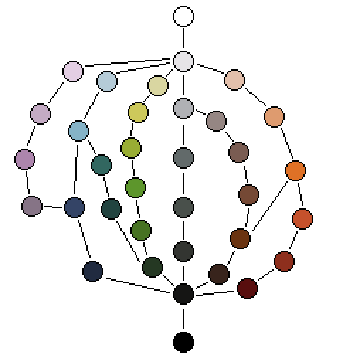
If you’re not familiar, a color ramp is a set of colors that can be used together in an object to show light and shadow - basically, a set of related colors organized from darkest to lightest. I had previously been creating independent color ramps for each hue I used. This works, but it doesn’t do much to minimize the number of colors used. When the color ramps overlap each other and share colors, it helps reduce the number of colors and makes the whole palette more cohesive. Referring to the examples in the links above, I created this color palette for Bludgeon:

In this image, the different color ramps are illustrated by the lines connecting the colors. You can see that all of the color ramps merge together at the dark end and the light end. Also, some of them intersect - for example, the pinks and blues, the blues and greens, and the browns and oranges. I found that I really like this way of visualizing a color palette. It helps me see how all the colors are related, and it shows me color options that I’d overlook if I was just looking at a grid of colors.
The process I used to create this palette went as follows:
- I chose several of my favorite colors from the Bludgeon artwork I’d created so far.
- I tried to figure out ways in which these colors related to each other. I mostly did this by dragging color splotches around in my image editor until I got them organized in a way that looked right.
- I filled in the gaps between the colors. I often did this by interpolating between the colors on either side, and I sometimes did it just by picking other colors I liked that seemed to fit.
- I made a lot of small tweaks to the color palette, mostly based on whether I felt I had all the colors I needed. This part involved a lot of trial and error. I didn’t really have a specific color count in mind - I just tried to keep it to a minimum while still feeling like I had enough colors for everything.
Once I was happy with the color palette I created, I applied it to my existing artwork. I think it turned out pretty good - it seems to have helped a lot with making the artwork look more cohesive and adding some needed contrast. Here are some comparisons between the old versions and the new versions:


You might notice that the bottommost image (the world map) doesn’t have too many differences between the old version and the new version. This is because I was already pretty happy with most its colors, so I made sure to put a lot of them in the final color palette.
I’m sure I still have a lot to learn when it comes to choosing colors, but I feel like this experiment went really well. I think I picked a good point in time to go through this refinement process. I had enough existing art to be able to figure out what sorts of colors I wanted, but I didn’t have so much art done that it would be a ton of work to update the colors using the new palette. If you have any thoughts, please leave a comment below. I hope this post is helpful to others who are still learning, but I’d also love to hear any insight from people who have more experience with this stuff.