I’ve recently been working on updating the background art for Bludgeon. For quite a while, I’ve been using a very boring, plain, brick wall as the background during combat (you can see what it used to look like in this video). This was fine for initial versions of the game, but I really wanted to make something nicer. I decided to start out by making a dungeon, though I’m planning to eventually make several different levels to fight in.
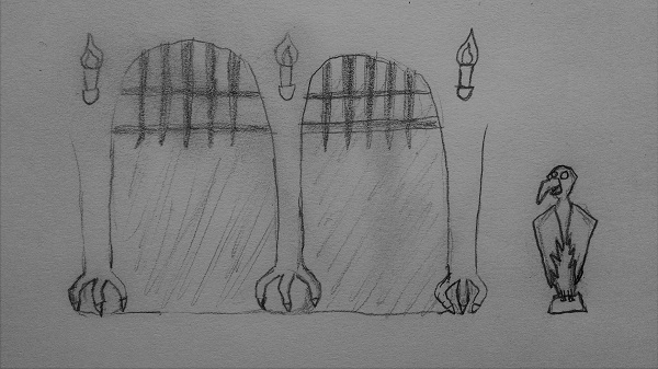
My first step was to brainstorm about ideas of what would be in a dungeon, specifically a dungeon in the world of Bludgeon. Since the gameplay of Bludgeon is heavily focused on birds, I thought of making the game world very bird-centric as well. Because of this, I tried to think of how birds or bird-like figures could be displayed in a dungeon background. The initial idea I came up with was to have stone pillars between cells that had bird-like feet at the bottom. I also wanted to put some bird statues in the dungeon. With that in mind, I spend some time drawing and came up with this concept art:

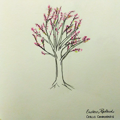
While I was doing a Google image search to find sources of inspiration for bird statues, I came across these cool/creepy pictures of animals that had been calcified in a lake with high soda and salt content. I ended up basing my statue off of the picture of the dove. My concept art had turned out creepier-looking than I had anticipated, but I decided I liked it. While I was drawing pictures of a creepy dungeon, my wife, Kezia, was drawing beautiful pictures like this:

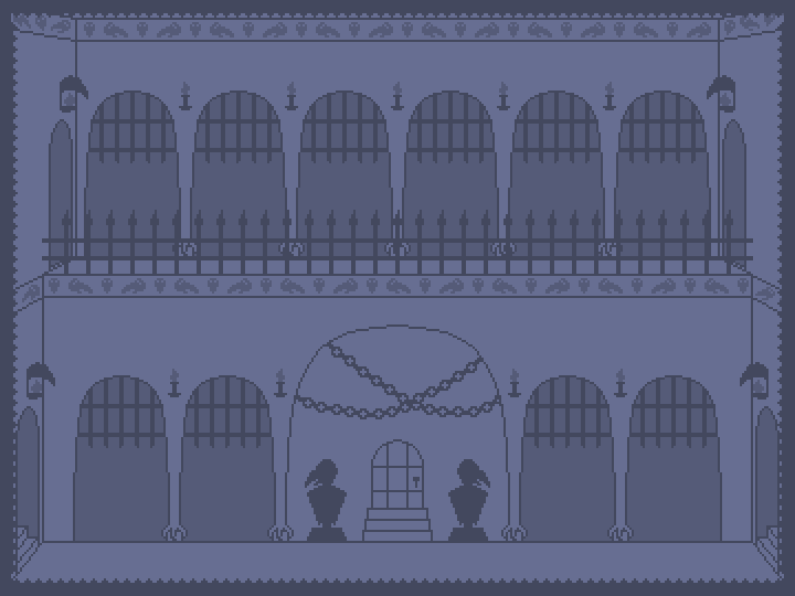
After coming up with some concept art that I liked, my next step was to draw a rough pixel art version of the background, to get the main structure and layout in place. In addition to the ideas from my concept art, I also added chains, beak-like torches, pictures of bird faces along the walls, stairways, and an iron railing. If I remember correctly, the beak-like torches were Kezia’s idea. I like them – they kind of remind me of the mask gates from Mario 2. Also, while drawing this rough draft, I had to find an article to give me a refresher on how to draw in one-point perspective – it had been a while since I’d done that!

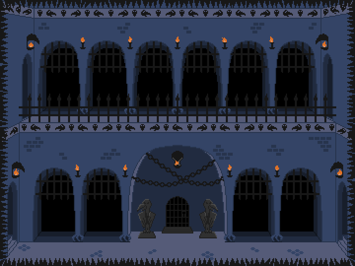
Now that I had the basic structure for my background, it was time to fill it in with details, colors, and shading (I’m still trying to get better at the shading part). I decided to add bricks only in some places to give the impression of texture on the wall while keeping it clean and simple. I also made the spikes more irregular to make them more visually interesting and to make them stand out more (some people previously had trouble noticing the spikes during playtesting). I also animated the flames on the torches, though you can’t tell that from this static image. I might tweak the background a bit later to clean some stuff up or to add more detail (perhaps adding irregularities to make the dungeon look more aged), but I’m pretty happy with how it turned out.
